Urban transport systems are the combination of a massive mix of activities. As thousands or millions of individuals undertake journeys from A to B, patterns emerge that are indicative of the types of activity being undertaking.
In this research, to gain insight into these patterns, community detection algorithms are used to identify clusters of activity in traffic flow across the London road network.
Community detection algorithms were developed to identify clusters of entities within network datasets. These methods are most often applied to examples within the social network sphere, in the identification of friendship groups.
Resulting clusters indicate high inter-connectivity compared with a reduced connectivity with the rest of the network. Here we apply the same concepts to traffic flow, aiming to identify where high coupling exists between clusters of nodes.
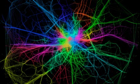
The map above visualises the resulting set of modules – each colour representing a distinct group – identified through the application of community detection methods to a topological representation of the London road system. Node connections are formed and weighted according to the routes of 1.5 million minicab journeys through London.
The resulting visualisation, apart from being quite pretty (thank Gephi for that), reveals some interesting trends. To a certain extent, a number of expected patterns in traffic flow are prevalent, with some of the key routes into central London, such as the M3, M4 and A2, are grouped and clearly defined as distinct clusters. Yet the image also shows how both the M25, the ring road around London, and the North Circular, usually considered as single entities, can be segmented into modules defined by their usage.
We see further interesting patterns in central London too, where certain regions – notably Knightsbridge, Soho, Shoreditch the City and Hyde Park – are clearly defined as distinct modules. These would appear to be areas of high internal movement, and thus an indication of the way minicabs are used in central London (at least in the case of this minicab company).
The map shows areas (marked in the different colours) where there are high numbers of journeys within those regions. So in somewhere like Soho you see a lot of local activity, and so is identified as one cluster, whilst the M4, while much bigger in size, comes up as another cluster as people will tend to travel all the way along it. It must be noted though that it shows only shows taxi activity, not general activity on London's roads.
These results, here only in their initial stages, demonstrate how measures of network characteristics can help us to understand patterns of activity in the city.
Ed Manley (@EdThink) is a researcher at University College London, and runs the Urban Movements blog.
More data
More data journalism and data visualisations from the Guardian
World government data
• Search the world's government data with our gateway
Development and aid data
• Search the world's global development data with our gateway
Can you do something with this data?
• Flickr Please post your visualisations and mash-ups on our Flickr group
• Contact us at data@guardian.co.uk
• Get the A-Z of data
• More at the Datastore directory
• Follow us on Twitter
• Like us on Facebook

